I built a correlation matrix over my own life

For about two years I have been quietly piping every trackable signal from my life into one SQLite file. Weight from the scale, heart rate and sleep stages from Fitbit, meals from the food tracker, gym sets from my phone, padel matches from Playtomic, gigs from my own booking database, calendar events from Google, screen time, wallet spend from my personal-finance app, tasks from Groove, and AI usage cost. Twenty-four daily numbers.
This week I stopped just looking at them one at a time and computed the full pairwise correlation matrix across the last ninety days. Two hundred seventy-six pairs. What came back was more useful, and more sobering, than I expected.
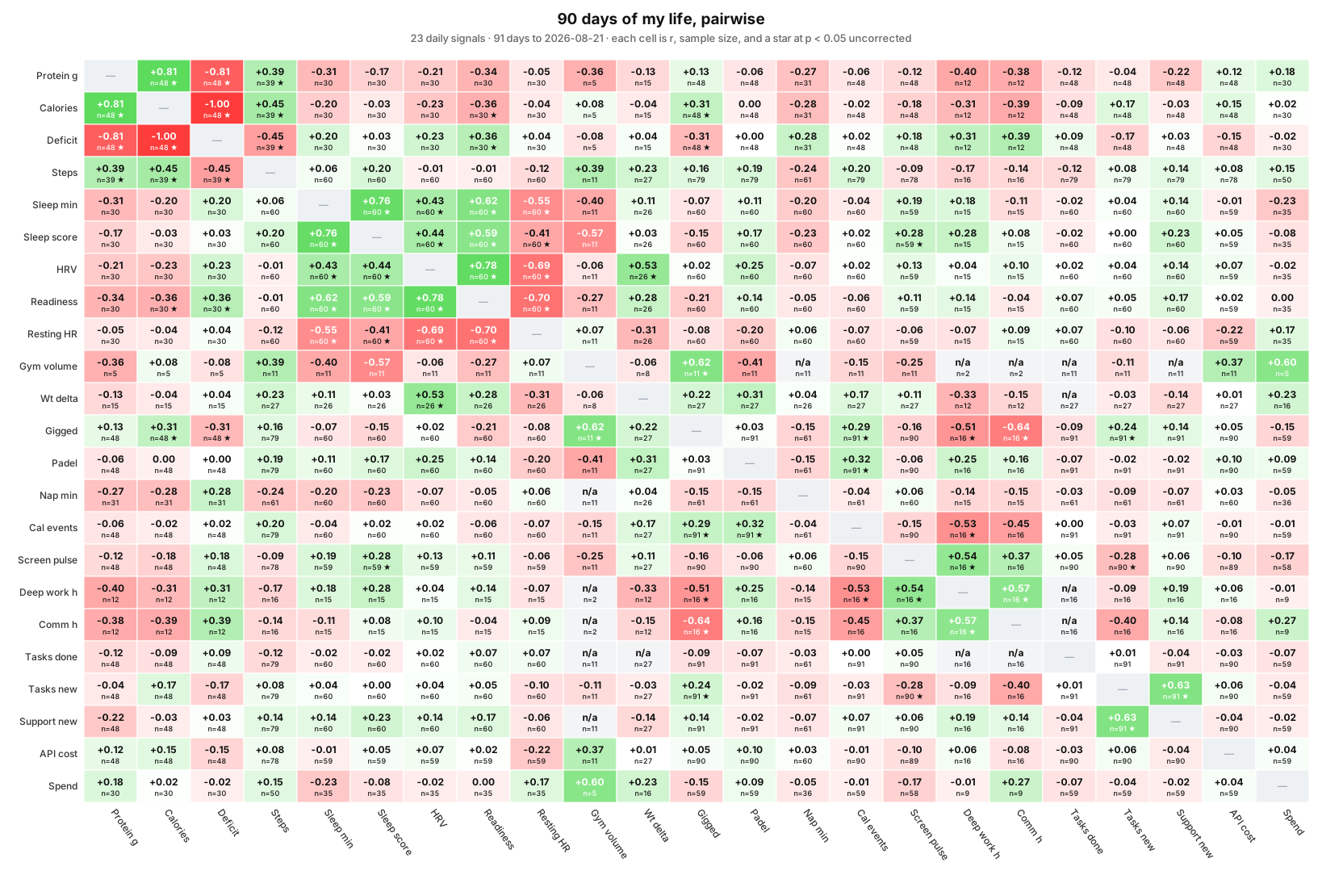
Update, 23 September 2026. The figure above is that same ninety-day window redrawn, because the original screenshot was cropped on the right and lost its last two columns. Two cells moved while it sat there, and both are worth more than the picture. The calendar-events-to-spend link below, at +0.55 the strongest finding in this post, now reads -0.01: a calendar I connected after publishing back-filled eighteen events into this window, so the signal it was measured on is not the signal that exists today. Separately, the protein, calories and deficit columns shifted when I fixed a grouping bug that had been silently dropping meal rows carrying a timestamp instead of a date. Neither finding decayed. Their inputs were redefined underneath them, which is the failure mode this whole exercise is supposed to catch.
Why do this at all
The default reading of health data is siloed. Fitbit tells me my HRV is up. MyFitnessPal tells me I ate 1900 calories. Playtomic tells me I won a padel match. Each app confidently graphs its own axis but has no idea any of the others exist. That is fine for products, and useless for the actual question: which levers move which outcomes on which days.
Public studies do not fix this. They tell you what worked on average across a hundred strangers over a controlled month. Your body and your work rhythm are not a hundred strangers. A personal correlation matrix is different: it is small, it is yours, and every pair is scored on days where you were the subject.
The scientific-viz cliche is that correlation is not causation. True, and worth repeating. But a correlation matrix is also the fastest cheap experiment you can run: it tells you which pairs are worth intervening on next, and which are noise. Everything downstream is A-B testing.
What is in the matrix
Twenty-four daily signals across three families.
Body. Protein, calories, deficit, steps, sleep minutes, sleep score, HRV, readiness, resting heart rate, weight delta.
Behaviour. Gym volume, gigged (played a jazz gig that day, yes or no), padel (played a match, yes or no), nap minutes, calendar events, screen time, deep-work hours, communication hours.
Work. Tasks I closed, tasks assigned to me, new customer-facing tickets, AI API spend, wallet spend.
Everything comes from local databases my own systems write to. The heatmap is rendered by a page that recomputes on every load, so if I log a meal and reload, the matrix has moved.
What the data actually said, week one
Three things stood out.
1. Busy calendar days are spending days. r = +0.55 across 59 days of overlap. The strongest non-trivial link in the matrix. More meetings and events on a day, more euros out the door. Almost certainly meetings dragging me into lunches, coffees, parking, taxis. It is the kind of unglamorous finding that would never make a paper and would probably beat any brilliant productivity intervention if I actually acted on it. Test I am running this week: pick my heaviest meeting day, pack lunch, no discretionary buys, see if that day's spend lands below my thirty-day median.
2. Padel days improve next-morning HRV. r = +0.28 across 60 days. Also resting heart rate down by a similar amount. The everyday reading is that harder cardio makes you more tired, but the autonomics point the other way: HRV rises the morning after I play. That is worth knowing when planning heavy weeks.
3. Meta finding: multiple comparisons matter. With twenty-four signals I have 276 unique pairs. At an alpha of 0.05, I should expect about fourteen "significant" stars purely by chance. Any single starred cell is close to useless. The threshold I now use is r above 0.3 with n above 30, and I only trust findings that recur across weeks.
Two things I learned about doing this well
The first is that the biggest wins are in the second look, not the first. A meaningful fraction of the strong correlations I found on pass one turned out to be artifacts. Calendar minutes being perfectly collinear with calendar event count. Signals from different apps counting the same underlying event twice, sometimes at wildly different resolutions. If I had shipped the matrix without spending an afternoon interrogating each strong pair, I would have carried around three or four confident-sounding lies for a month before catching them. Build in a checking step.
The second is that most of the value is in the boring pairs. Nothing in this data suggested a hidden lever I did not know about. The findings all sound obvious in hindsight: busy days cost money, cardio helps recovery, bad sleep prompts naps. The point is not novelty. The point is that I now have a running instrument I can point at any candidate intervention and see whether it moves anything, versus another year of vibes.
The actual point
The durable asset here is not the heatmap. It is the pipeline underneath. Twenty-four signals I own, computed on ninety rolling days, and read for me. Every Monday morning my personal-doctor agent Bryan opens the matrix, reads the last two briefs to see what moved, applies the real threshold, and writes me a five-part note: what to act on, what to watch, what recurs, what changed since last week, and what has been in the matrix long enough to declare dead. Wayne, my review gate, decides whether the finding lands in my Telegram now or in the next morning digest. I read the note. I do not read the matrix. If I decide next month to test creatine, or to move gigs earlier, or to cap communication hours, I have a baseline to compare against without having to remember what "before" felt like.
You almost certainly have the same data lying around, split across a wearable, a calendar, a task app, a wallet, and a screen-time tracker. It is worth the afternoon to yank it into one place. The number the matrix spits out at the end matters less than the fact that you are finally reading your own life on the same axis instead of on five different dashboards that all pretend to be the whole picture.