I built a correlation matrix over my own life, part 2

A week ago I wrote about pulling every trackable signal from my life into one SQLite file and computing a pairwise Pearson correlation matrix over the last ninety days. Twenty-seven daily numbers, 351 unique pairs, three findings worth acting on. That post is here.
This week I fed the same rectangle into a completely different algorithm and got back a completely different shape of answer.
The limit of a Pearson matrix
A pairwise correlation matrix is, structurally, a big list. Two hundred and seventy-six pairs of numbers, each scored in isolation. If A correlates with B and B correlates with C, the matrix tells you both facts but does not tell you that A, B, and C form a triangle. It does not tell you that B is the pivot point where three signals converge. It does not tell you which nodes are hubs and which are leaves.
That is a real limitation. My life is not a list of pairs. It is a graph.
AutoCM
AutoCM is a family of correlation algorithms out of the Semeion Research Center in Rome, developed by Professor Massimo Buscema and his group. The math is Semeion's, decades in the making, and lives across Buscema's papers on artificial adaptive systems and graph-based data mining.
The relevant variant for me is Meta-AutoCM, which produces two things from a numeric matrix. A Minimum Spanning Tree, the tree of strongest links that touches every variable exactly once, and a Minimum Realized Graph, a denser version that keeps every edge above an internal significance threshold. The output is a Pajek network file with per-node activity scores, so every variable is placed inside a topology rather than just having a row of correlation coefficients.
I ran the same ninety-day matrix through it. Same twenty-seven columns, same rows, same source SQLite. The preprocessing was different: AutoCM wants a fully-populated non-negative rectangle, where my Pearson code was happy with pairwise-complete null-tolerant columns. So I filled missing cells with each column's median and shifted every column so its minimum was zero (correlation is invariant under translation, so this is safe). Plain AutoCM's spectral clustering step crashed on my data, but Meta-AutoCM chewed the whole matrix, all twenty-seven signals, without dropping a single column.
What came back
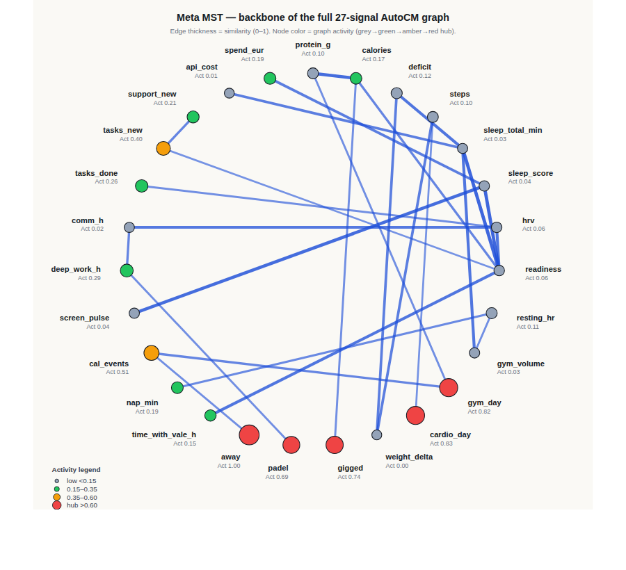
Here is the Meta MST backbone. Twenty-seven variables, twenty-six edges, laid out on a circle. Edge thickness is similarity on a zero-to-one scale. Node color is graph activity, which is AutoCM's measure of how central a node is to the overall structure: grey for a leaf, green for a bridge, amber for a well-connected node, red for a hub.
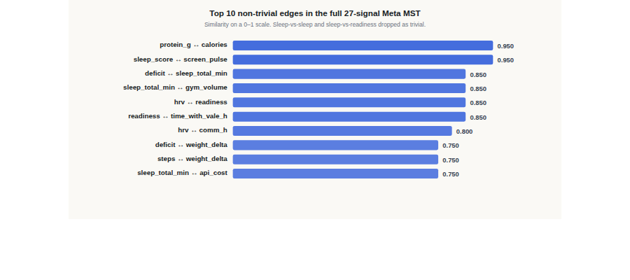
The trivial links, sleep-minutes with sleep-score with readiness, sit near the top of any pairwise ranking on any algorithm because they are literally derivations of each other. If I filter those out, this is what is left.
What Pearson missed
The single most surprising thing in the graph has nothing to do with pair strengths. It is which nodes turned out to be the hubs.
The binary behaviour columns run the network. The five highest-activity nodes are all yes-or-no lifestyle indicators: away (1.00), cardio_day (0.83), gym_day (0.82), gigged (0.74), padel (0.70). Then cal_events (0.51). These are the same columns that in a Pearson matrix look mid-tier at best, because binary against continuous almost always gives you a smaller r than continuous against continuous. In the graph they are the structural centre. Whether I was away, whether I did cardio, whether I played, whether I gigged, whether the day had meetings on it: these are the switches that gate what the rest of the day looks like. Pearson sees each of them as one row of weak coefficients. AutoCM sees them as the shape of the week.
Sleep, readiness, and screen time form a tight cluster. The trivial derivations aside, screen_pulse ↔ sleep_score at 0.95, sleep_total_min ↔ deficit at 0.85, sleep_total_min ↔ gym_volume at 0.85, readiness ↔ time_with_vale_h at 0.85. Nine of the top twelve edges live inside this cluster. My Pearson matrix from last week showed a lot of medium-r pairs in this neighbourhood but did not reveal that they form one dense sub-network. On the graph it reads as a single object: sleep, recovery, screen time, workout volume, and time-with-my-partner are all part of the same daily rhythm, and each pair inside the cluster is stronger than any single pair looks in isolation.
What the graph did not confirm
The two Pearson findings I actually acted on last week did not survive as headline edges in the graph.
cal_events ↔ spend_eur was Part 1's strongest non-trivial pair at r=+0.55. In the Meta MST, cal_events connects instead to gym_day at 0.65 and away at 0.55, and spend_eur sits mostly on its own with a single medium link to sleep_score at 0.75. The two variables are in the graph but not near each other.
padel ↔ next-morning HRV at r=+0.28 was Part 1's second finding. padel in the graph has exactly one MST edge, to deep_work_h at 0.55. It never touches hrv at all.
This is not AutoCM disagreeing with Pearson. It is AutoCM answering a different question. Pearson scored raw pairwise similarity, treating binary and continuous columns symmetrically and finding the cal-spend link by day-by-day co-movement. AutoCM built a graph where each edge has to earn its place against every other candidate edge for the same node, and where a same-day continuous-vs-continuous match will nearly always beat a same-day binary-vs-continuous one. Both are correct within their own frame. Neither is a substitute for the other.
The meta lesson
There is a bad version of this post where I claim AutoCM found things Pearson missed and imply Pearson should be retired. That is not what happened. What happened is that two algorithms with different assumptions looked at the same data and produced compatible but non-overlapping answers. The Pearson matrix is a map of pair strengths. The AutoCM graph is a map of network structure. Both are correct, both are partial, and choosing which to run depends entirely on what question you are trying to answer this week.
The upgrade is not "switch to the fancier algorithm". The upgrade is knowing which lens fits which question. If I want to know whether to pack lunch on meeting-heavy days, Pearson on binary calendar and continuous spend is the right tool. If I want to know which variable to put my next self-experiment on because it is a hub touching four other things I care about, the graph is the right tool.
What is next
The pipeline underneath is unchanged. Twenty-seven signals, ninety rolling days, one SQLite file, my agent Bryan reading the Pearson matrix every Monday morning. I am adding a second cron that runs the AutoCM Meta MST on the same rectangle weekly and produces a two-line diff: which non-trivial edges appeared, which disappeared, which hub nodes shifted. Bryan will surface either result to me through Wayne, my review gate, only when something changes.
The durable asset, as before, is not the graph. It is the fact that any new algorithm someone points at me plugs into the same rectangle without me having to rebuild the ingest layer. Ninety days of my own life, in one shape, ready to be re-lensed by whatever tool comes next.